Choosing the right fonts for invitations for weddings sets the tone for your stationery and helps reflect the style of your day. The typography you choose can make your wedding invitations feel classic, modern, romantic or minimalist — and the right font can tie your whole wedding invitation suite together.
So how do you choose the best font for your wedding invitations? Here’s what to consider as you narrow down your options.
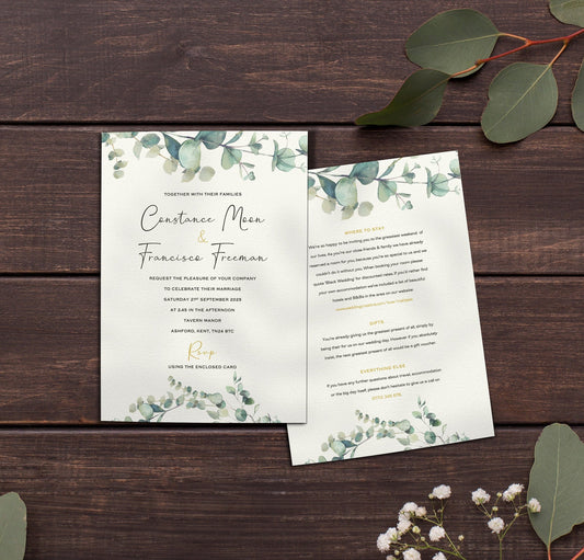
Fonts for Invitations for Weddings: What Works Best
When considering fonts for invitations for weddings, think about the overall theme, formality and readability. Some couples choose elegant script fonts for a romantic feel, while others pick modern serif or clean sans serif fonts for a minimalist look. Below are some of the most popular wedding invitation fonts and how to use them effectively.
Examples:
- Serif – Garamond: classic and timeless
- Sans Serif – Futura: clean and modern
- Script – Bickham Script: elegant and decorative
- Handwritten – Playlist Script: casual and personal
- Modern Serif – Didot: refined editorial feel
Wedding Invitation Font Inspiration by Style
Elegant & Classic
-
Script + Serif pairings
e.g., Bickham Script with Minion Pro
Minimal & Modern
-
Sans Serif + Geometric
e.g., Futura + Avenir
Rustic & Casual
-
Handwritten + Serif
e.g., Playlist Script + Baskerville
1. Think About Your Wedding Style
Is your celebration formal and traditional, or relaxed and rustic? Serif fonts (those with small lines at the ends of letters) often suit classic or elegant weddings, while clean sans-serif fonts feel more modern and fresh. Script fonts bring a romantic, handwritten touch that works well for soft, romantic styles.
2. Prioritise Readability
It’s tempting to choose the fanciest script you can find... but make sure it’s easy to read, especially for key details like names, dates and venues. If you're using a decorative font for headings, consider pairing it with a simpler font for the body text to balance style with clarity.
3. Limit the Number of Fonts
As a rule, stick to two complementary fonts per invitation. Too many different styles can feel cluttered. One for headings (such as your names), and another for the main information is usually enough.
4. Match Your Overall Theme
If your wedding has a specific theme... like vintage, coastal, boho or botanical... your font can subtly reflect that. Delicate calligraphy suits garden weddings, while bold, blocky fonts feel at home in urban or industrial settings.
5. Test Your Design Before Printing
Before sending anything to print, review a full-size sample to make sure your fonts look as expected. Check that spacing, sizing and contrast work well both on-screen and on paper.
Ultimately, the best font for your wedding invitations is the one that feels most like you. Whether it’s traditional, quirky or completely bespoke, the right typography helps your stationery tell your story... beautifully and clearly.
Fonts for Wedding Invitations FAQs
What font styles work best for wedding invitations?
Classic serif and elegant script fonts are popular because they convey timelessness and personality, but clean sans serif can suit modern weddings too.
Can I use more than one font on a wedding invitation?
Yes — combining a decorative script with a readable serif or sans serif can balance style and clarity.